Packaging Design

A collection of packaging design pieces I have done

PADDY'S IRISH PUB BEVERAGE PACKAGING
(SCHOOL)
PROJECT STORY
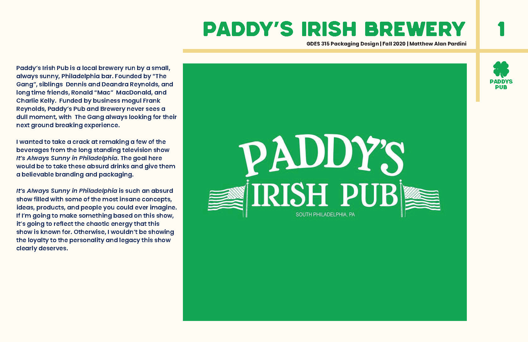
Paddyā€™s Irish Pub is a local brewery run by a small, always sunny, Philadelphia bar. Founded by ā€œThe Gangā€, siblings Dennis and Deandra Reynolds, and long time friends, Ronald ā€œMacā€ MacDonald, and Charlie Kelly. Funded by business mogul Frank Reynolds, Paddyā€™s Pub and Brewery never sees a dull moment, with The Gang always looking for their next ground breaking experience. I wanted to take a crack at remaking a few of the beverages from the long standing television show Itā€™s Always Sunny in Philadelphia. The goal here would be to take these absurd drinks and give them a believable branding and packaging.
Itā€™s Always Sunny in Philadelphia is such an absurd show filled with some of the most insane concepts, ideas, products, and people you could ever imagine. If Iā€™m going to make something based on this show, itā€™s going to reflect the chaotic energy that this show is known for. Otherwise, I wouldnā€™t be showing the loyalty to the personality and legacy this show clearly deserves.

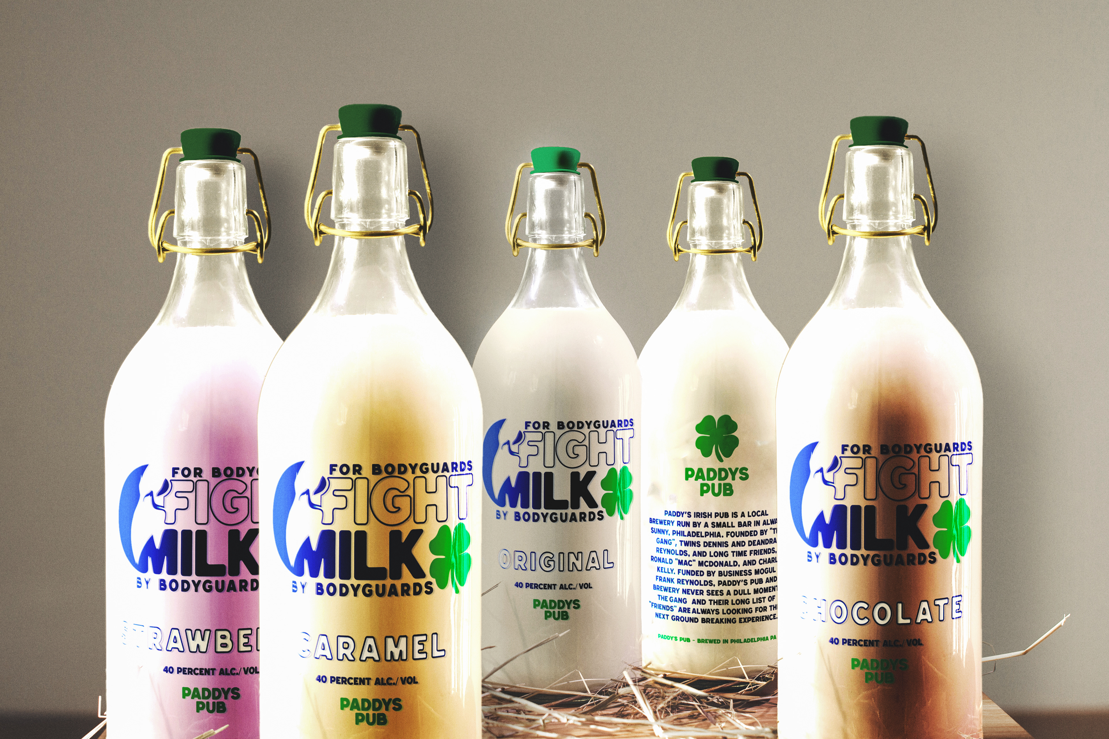
FIGHT MILK
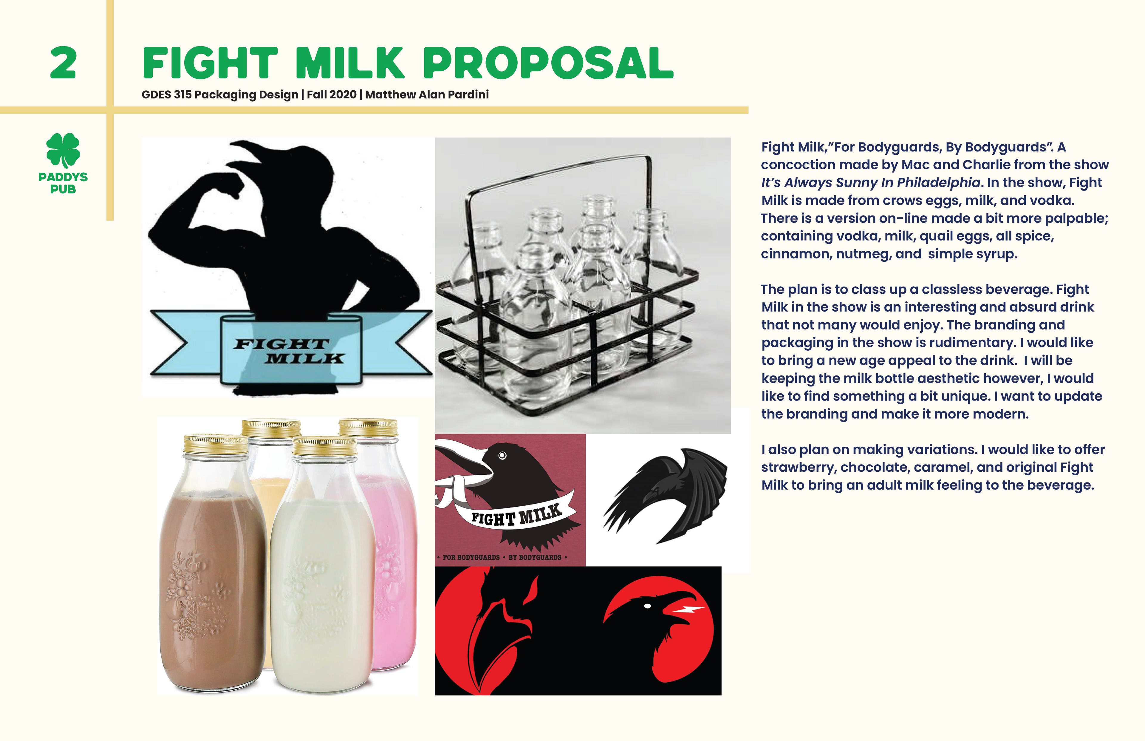
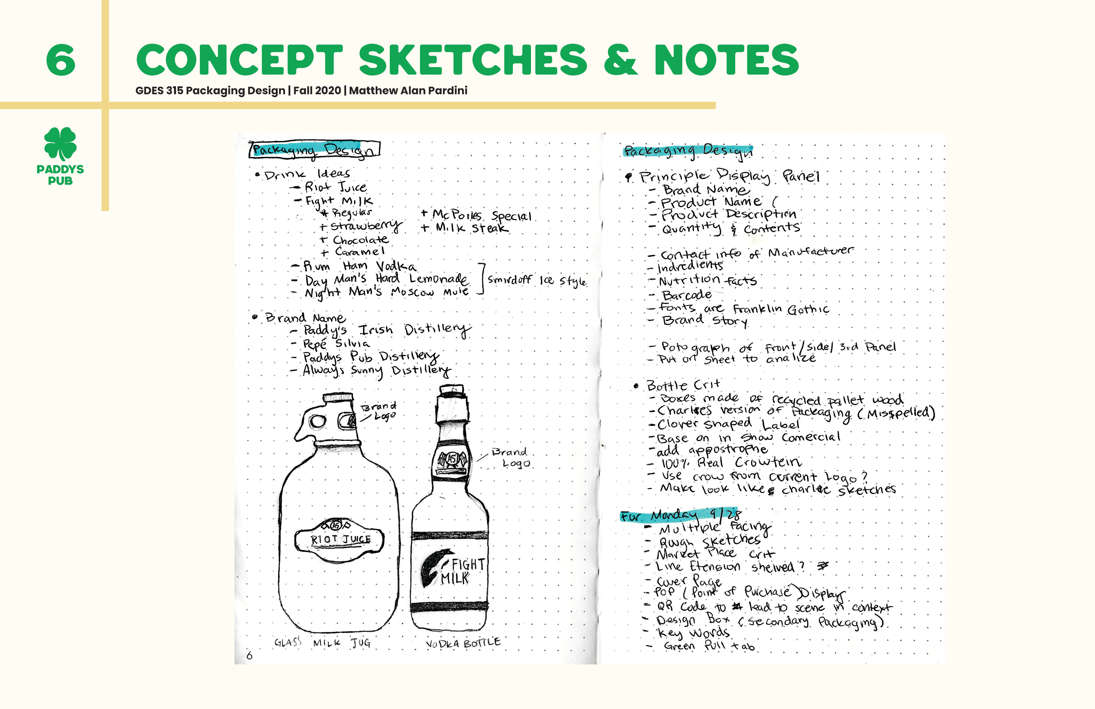
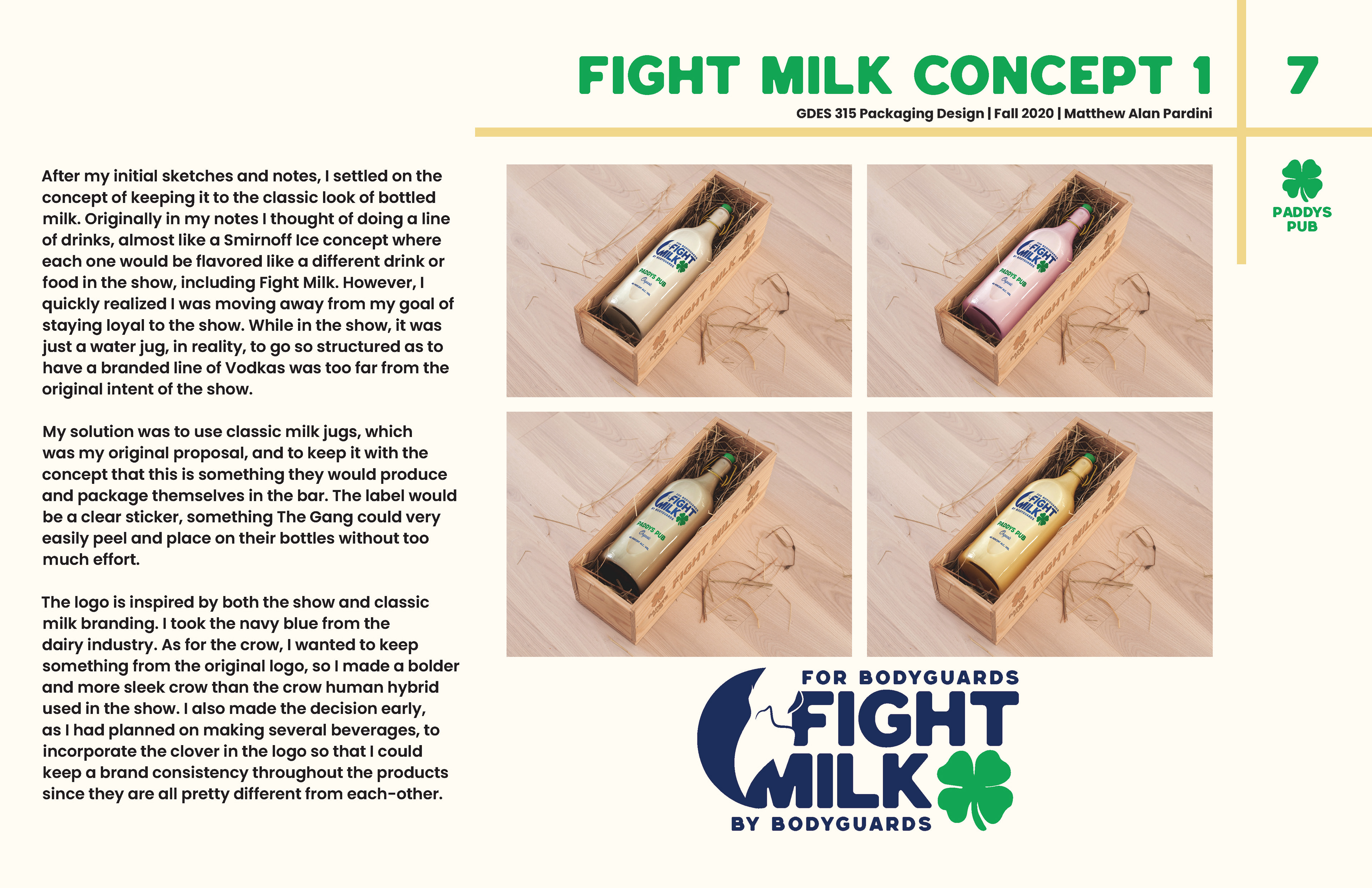
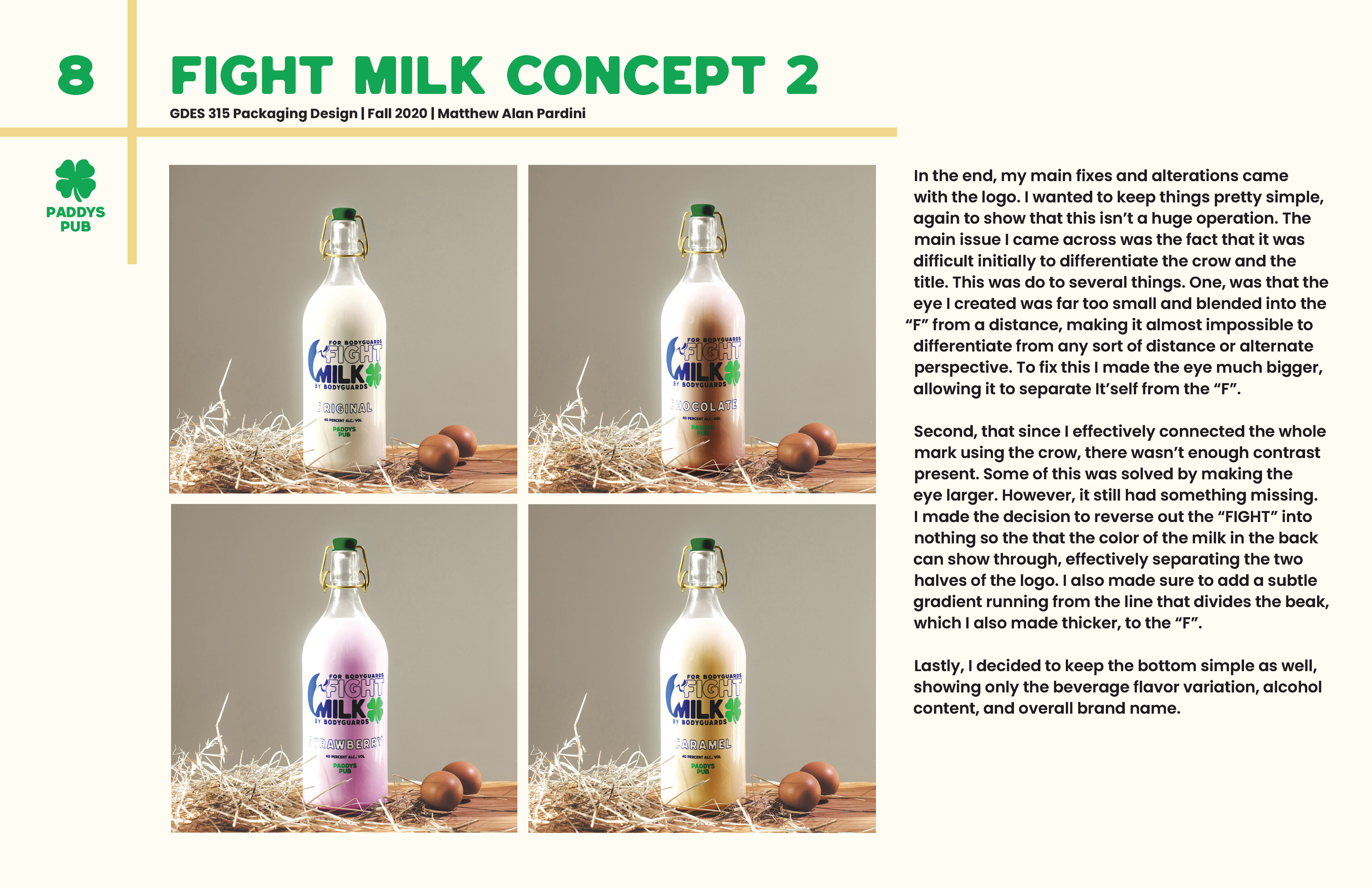
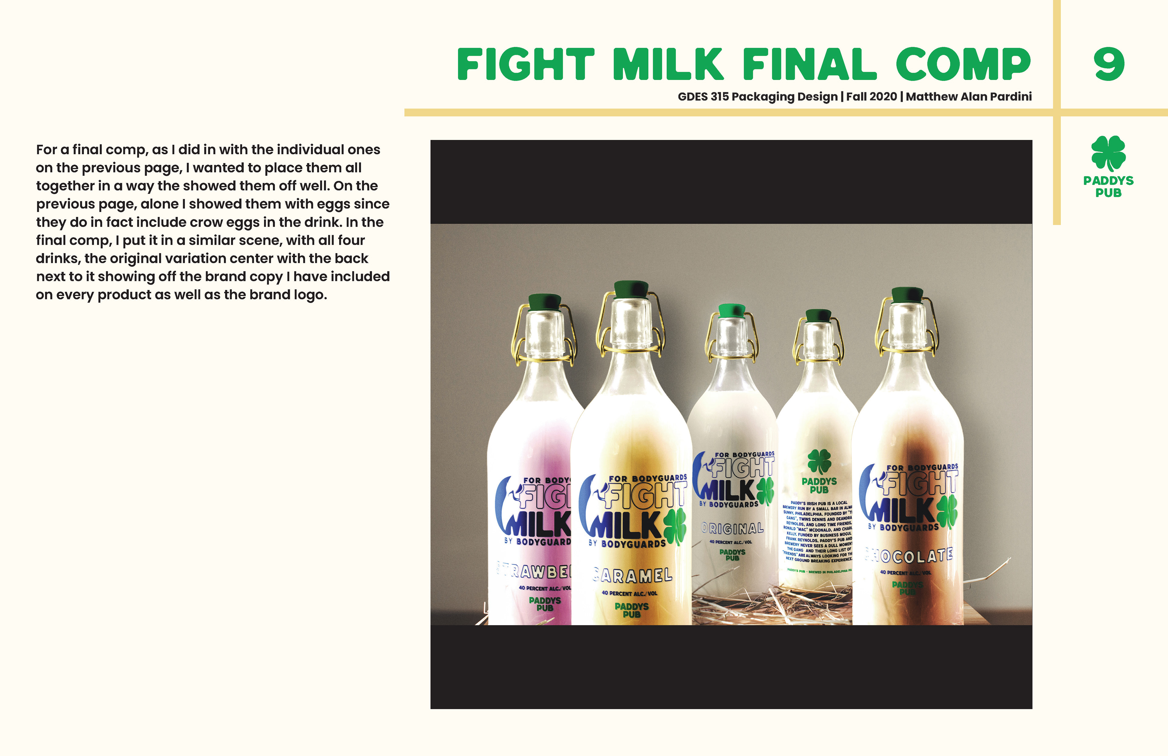
Fight Milk, "For Bodyguards, By Bodyguardsā€. A concoction made by Mac and Charlie. In the show, Fight Milk is made from crows eggs, milk, and vodka. There is a version on-line made a bit more palpable; containing vodka, milk, quail eggs, all spice, cinnamon, nutmeg, and simple syrup. The plan is to class up a classless beverage. Fight Milk is an interesting and absurd drink that not many would enjoy. The branding and packaging in the show is rudimentary, I wanted to bring a new age appeal to the drink. I kept the milk bottle aesthetic, updated the branding and made it more modern. I also made some variations, offering strawberry, chocolate, caramel, and original Fight Milk to bring an adult milk feeling to the beverage.

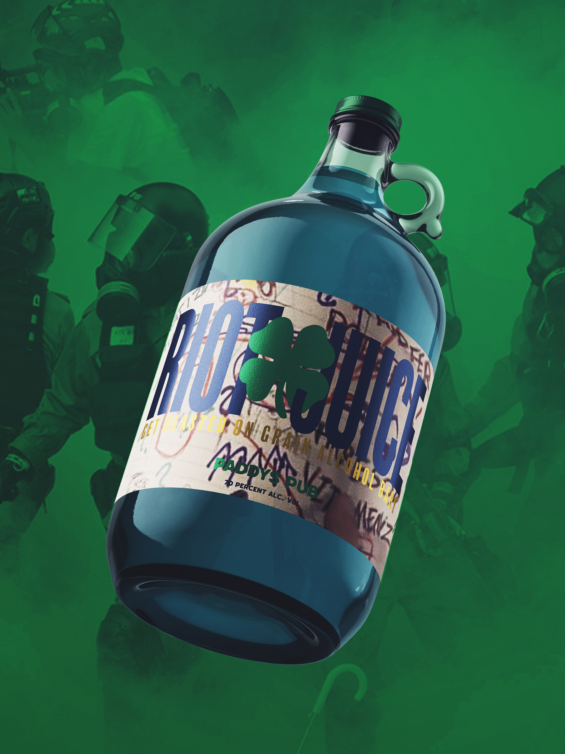
RIOT JUICE
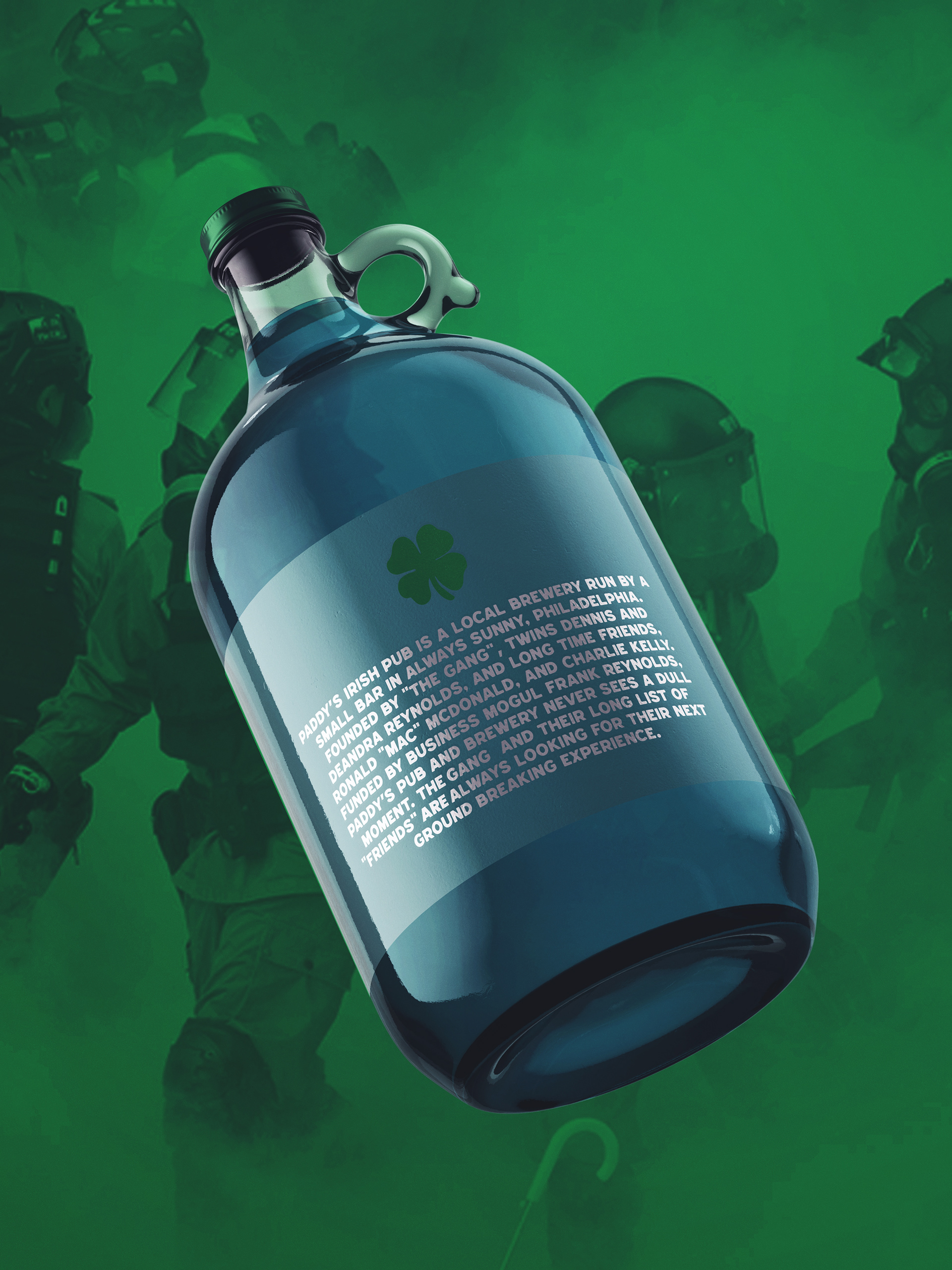
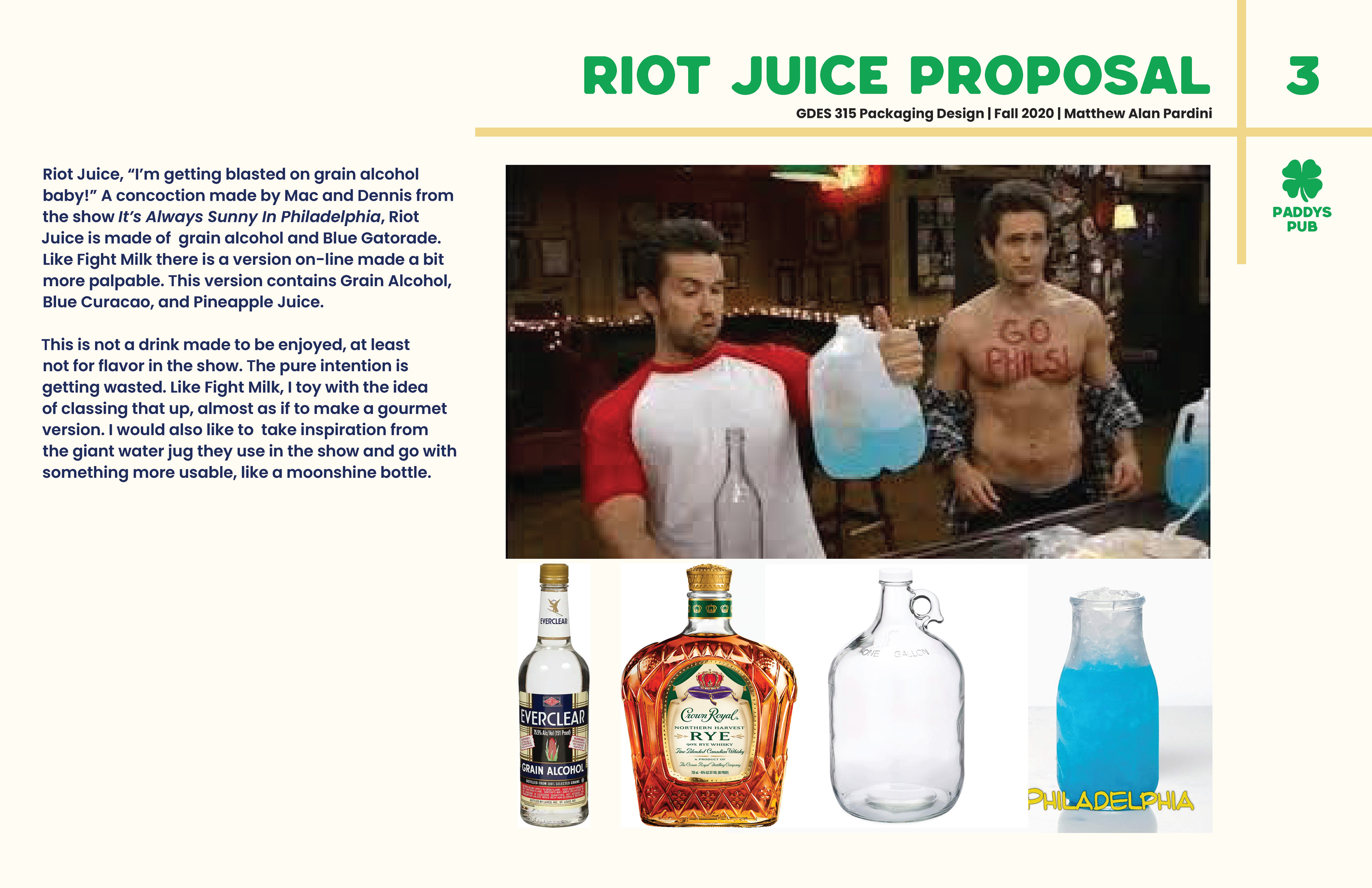
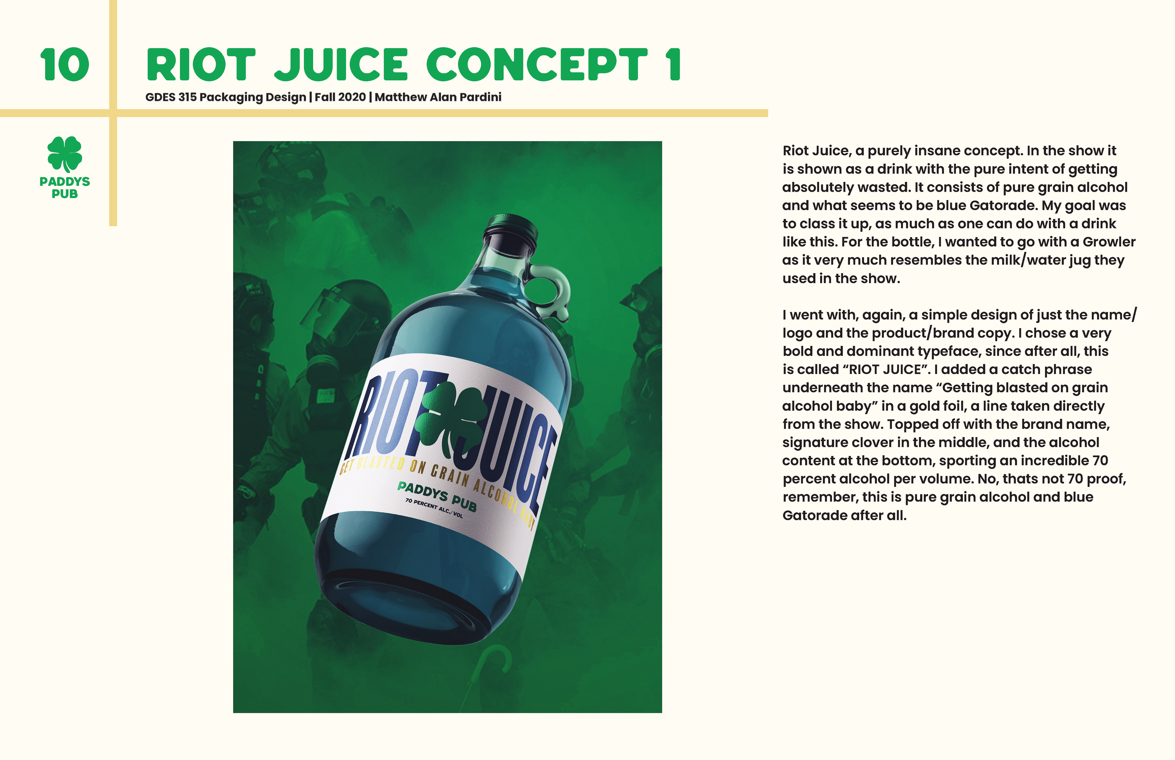
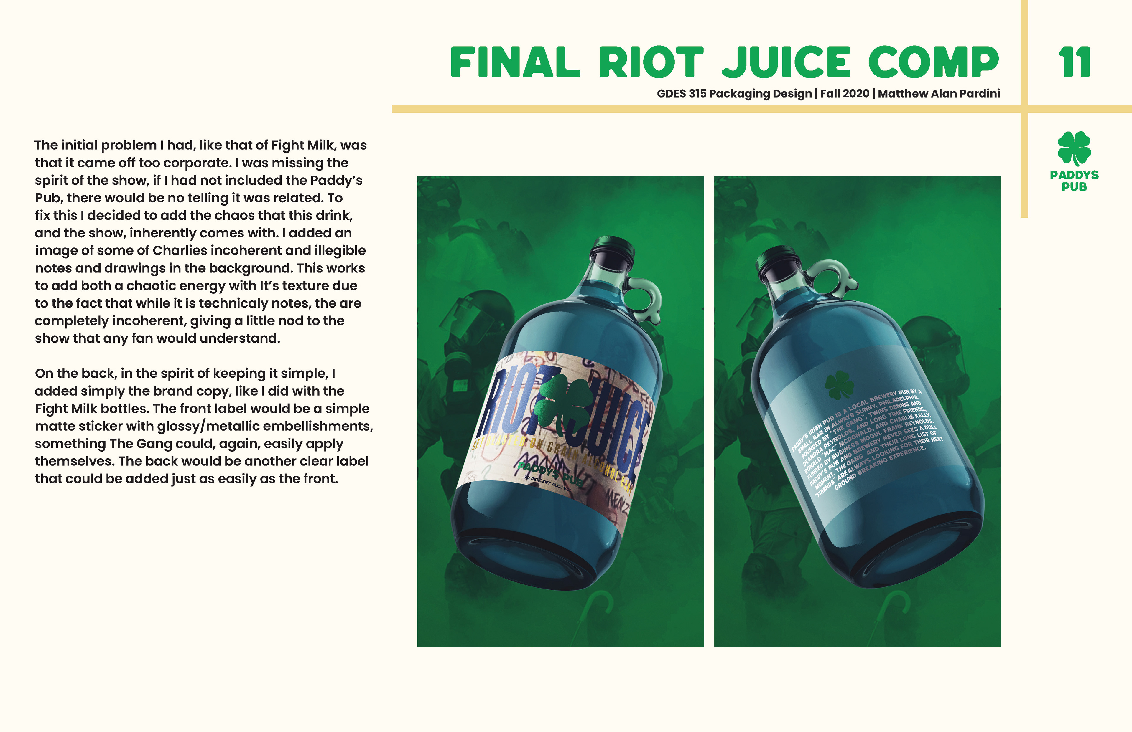
Riot Juice, a purely insane concept, in the show is shown as a drink with the pure intent of getting absolutely wasted. It consists of pure grain alcohol and what seems to be blue Gatorade. My goal was to class it up, as much as one can do with a drink like this. For the bottle, I wanted to go with a Growler as it very much resembles the milk/water jug they used in the show. I went with, again, a simple design of just the name/ logo and the product/brand copy. I added an image of some of Charlies incoherent and illegible notes and drawings in the background. This works to add both a chaotic energy with its texture due to the fact that while it is technically notes, the are completely incoherent, giving a little nod to the show that any fan would understand. On the back, in the spirit of keeping it simple, I added simply the brand copy, like I did with the Fight Milk bottles. The front label would be a simple matte sticker with glossy/metallic embellishments, something The Gang could, again, easily apply themselves. The back would be another clear label that could be added just as easily as the front. I chose a very bold and dominant typeface, since after all, this is called ā€œRIOT JUICEā€. I added a catch phrase underneath the name ā€œGetting blasted on grain alcohol babyā€ in a gold foil, a line taken directly from the show. Topped off with the brand name, signature clover in the middle, and the alcohol content at the bottom, sporting an incredible 70 percent alcohol per volume. No, thats not 70 proof, remember, this is pure grain alcohol and blue Gatorade after all.

IRISH DRAFT BEER
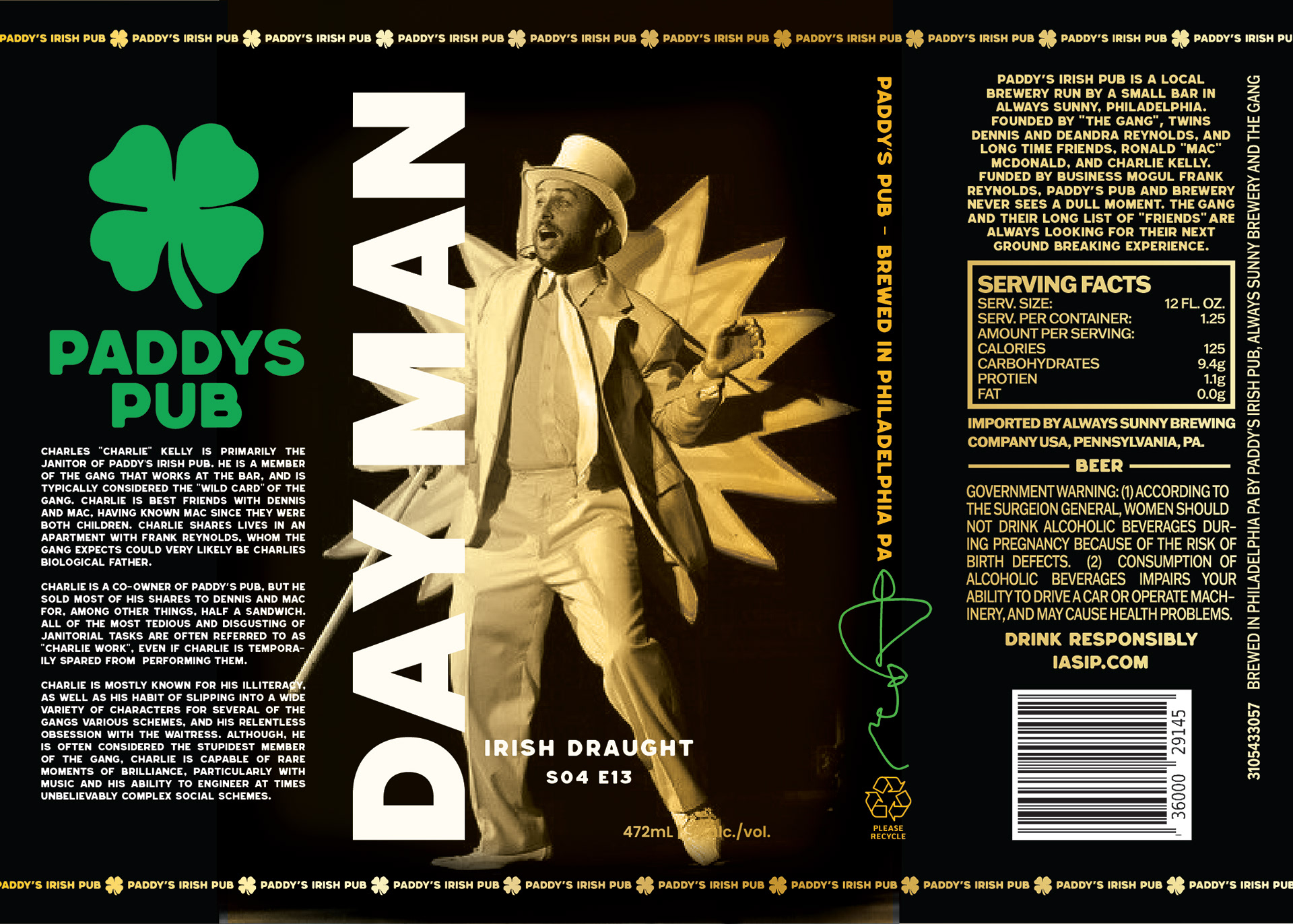
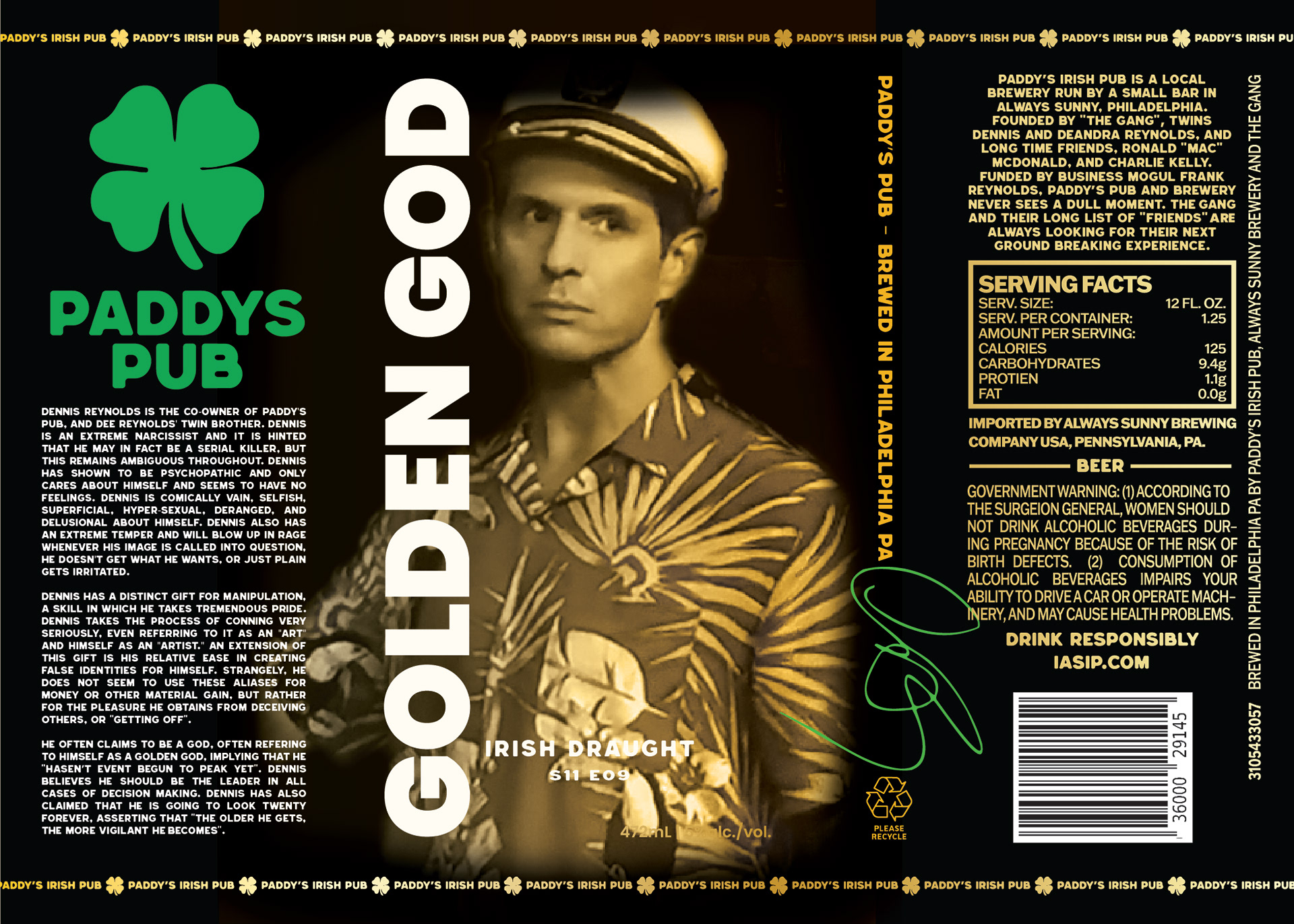
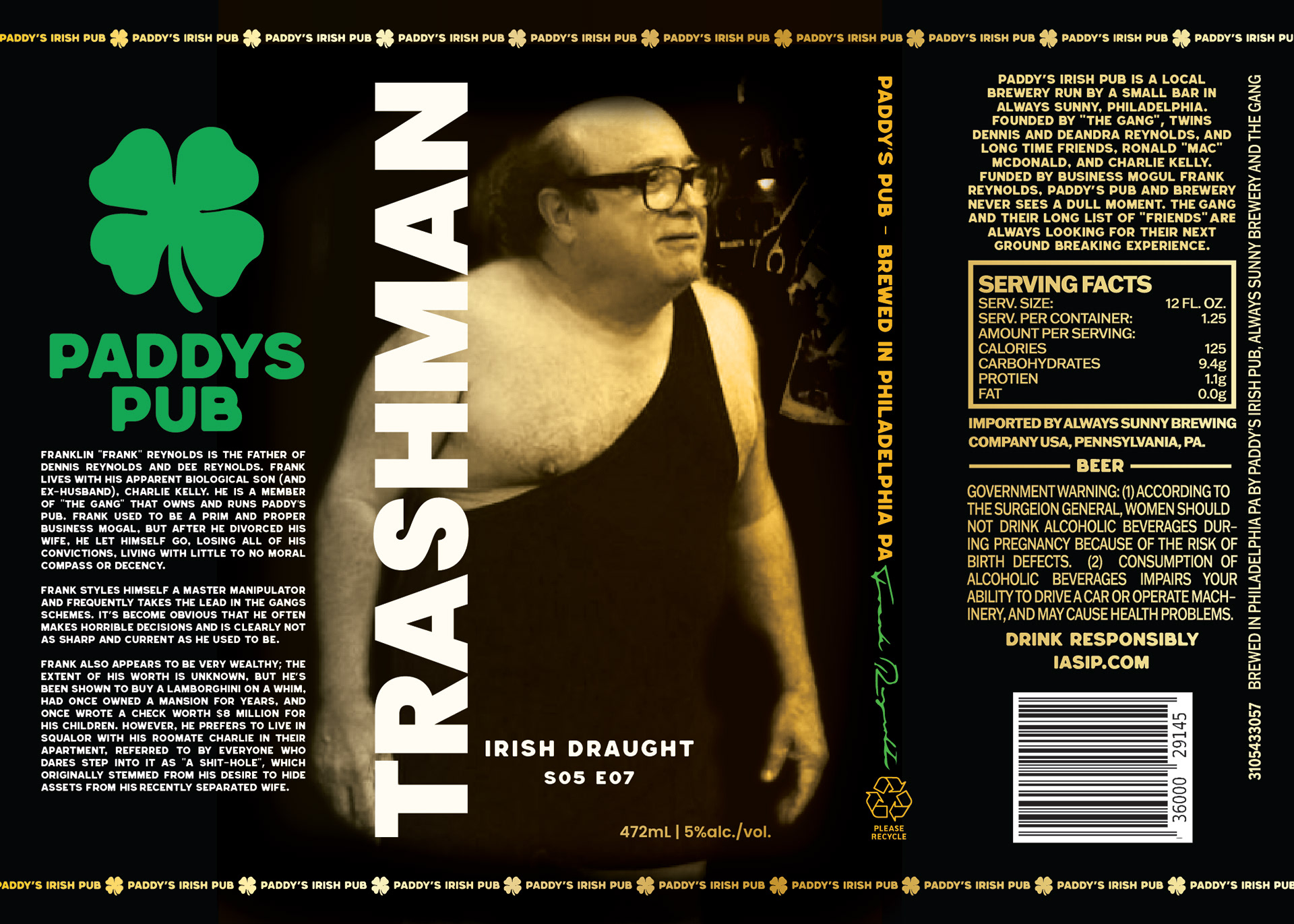
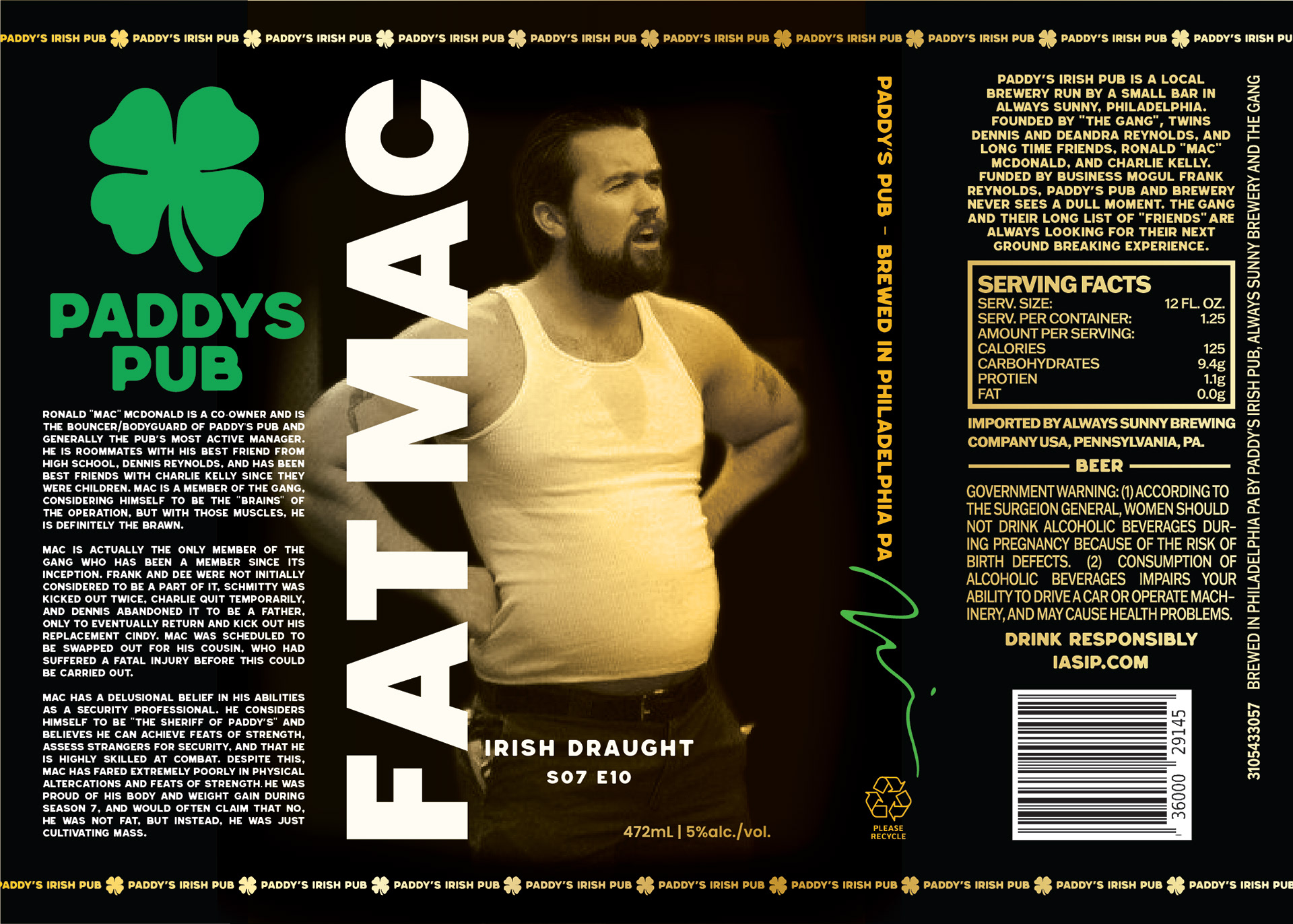
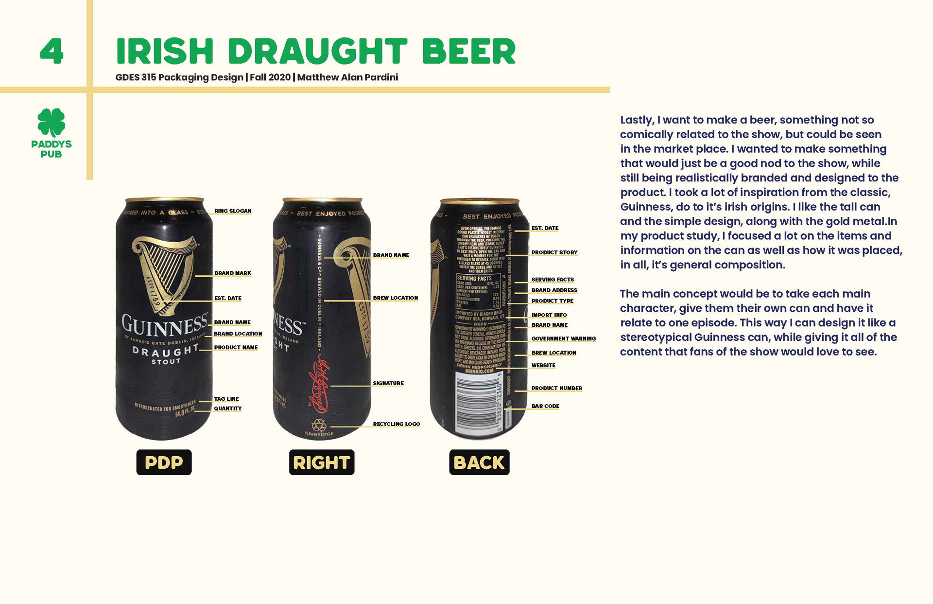
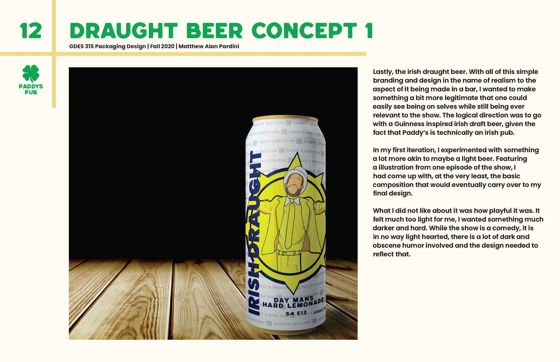
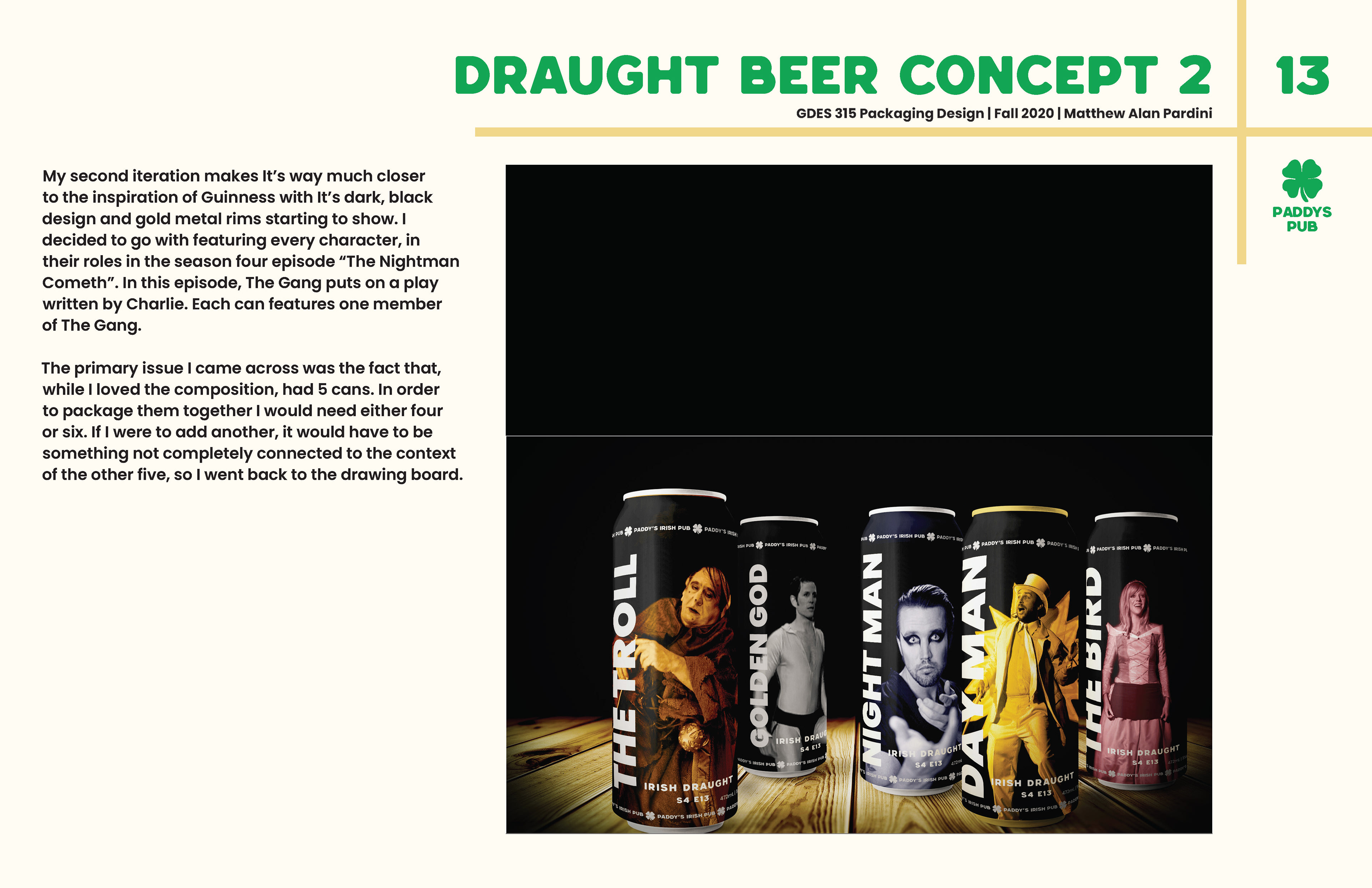
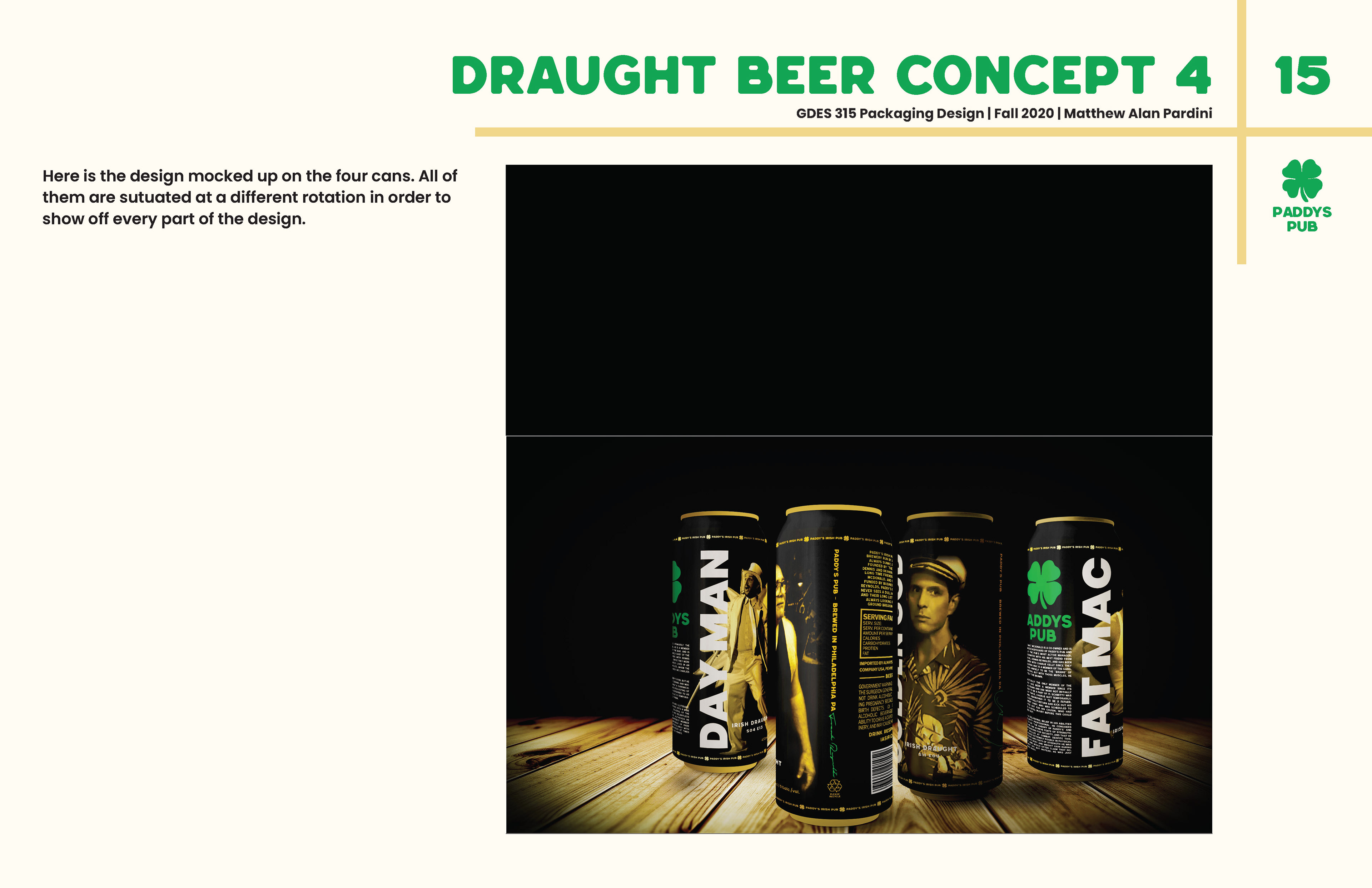
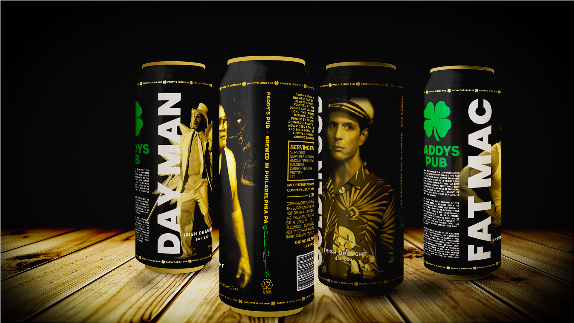
Lastly, the Irish draught beer. With all of this simple branding and design in the name of realism to the aspect of it being made in a bar, I wanted to make something a bit more legitimate that one could easily see being on selves while still being ever relevant to the show. The logical direction was to go with a Guinness inspired Irish draft beer, given the fact that Paddyā€™s is technically an Irish pub. The main concept would be to take each main character, give them their own can and have it relate to one episode. This way I can design it like a stereotypical Guinness can, while giving it all of the content that fans of the show would love to see.
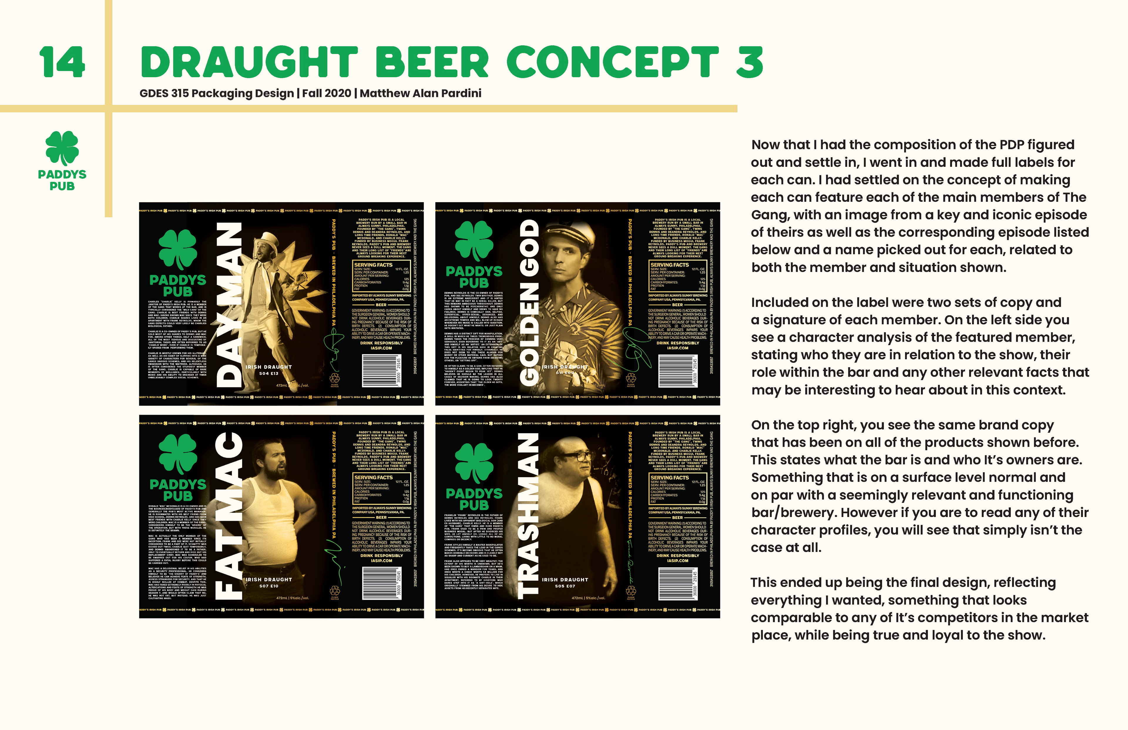
I had settled on the concept of making each can feature each of the main members of The Gang, with an image from a key and iconic episode of theirs as well as the corresponding episode listed below and a name picked out for each, related to both the member and situation shown. Included on the label were two sets of copy and a signature of each member. On the left side you see a character analysis of the featured member, stating who they are in relation to the show, their role within the bar and any other relevant facts that may be interesting to hear about in this context. On the top right, you see the same brand copy that has been on all of the products shown before.Ā  This states what the bar is and who its owners are. Something that is on a surface level normal and on par with a seemingly relevant and functioning bar/brewery. However if you are to read any of their character profiles, you will see that simply isnā€™t the case at all.
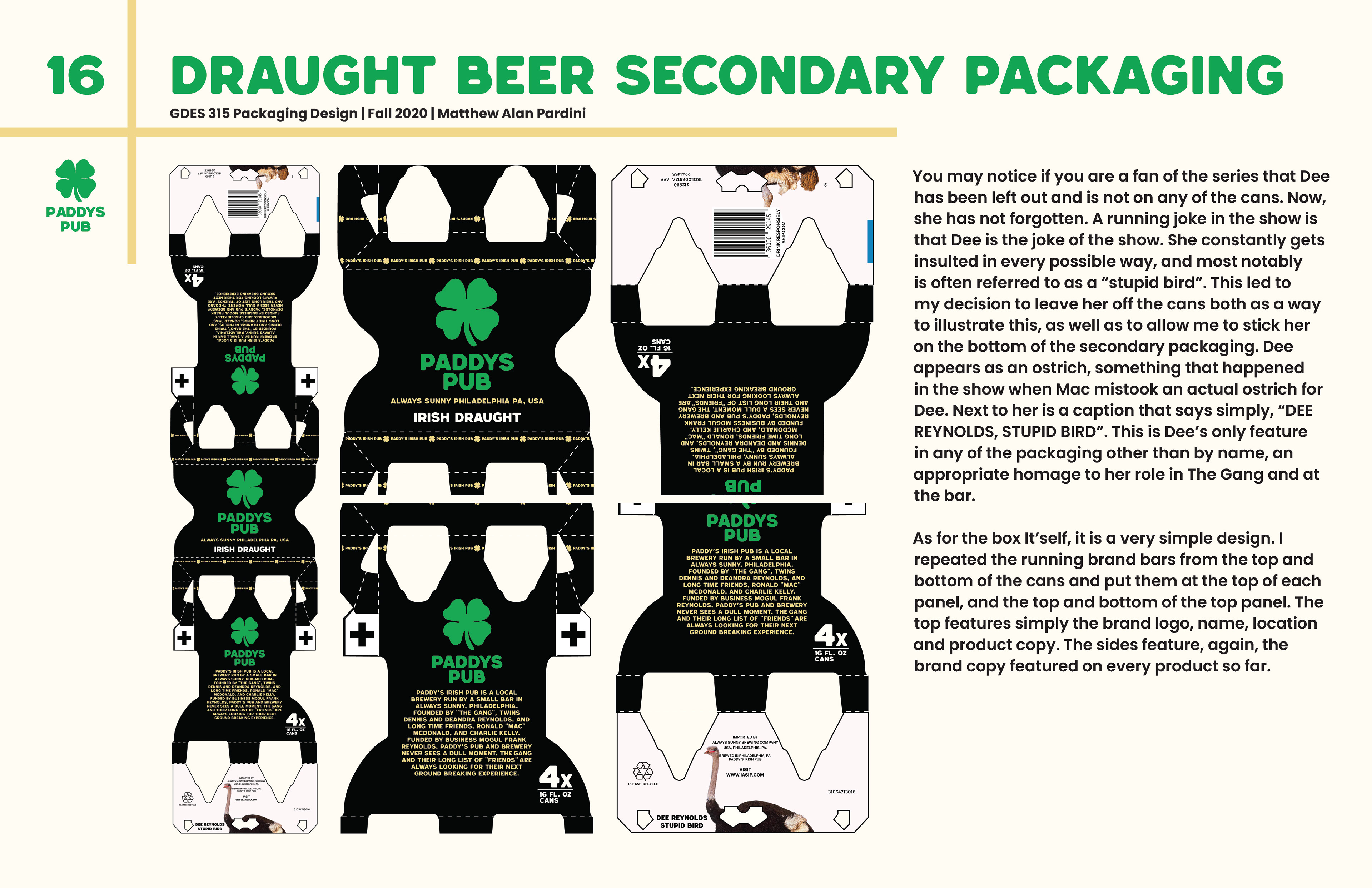
You may notice if you are a fan of the series that Dee has been left out and is not on any of the cans. She has not forgotten, a running joke in the show is that Dee is the joke of the show. She constantly gets insulted in every possible way, and most notably is often referred to as a ā€œstupid birdā€. This led to my decision to leave her off the cans both as a way to illustrate this, as well as to allow me to stick her on the bottom of the secondary packaging. Dee appears as an ostrich, something that happened in the show when Mac mistook an actual ostrich for Dee. Next to her is a caption that says simply, ā€œDEE REYNOLDS, STUPID BIRDā€. This is Deeā€™s only feature in any of the packaging other than by name, an appropriate homage to her role in The Gang and at the bar.
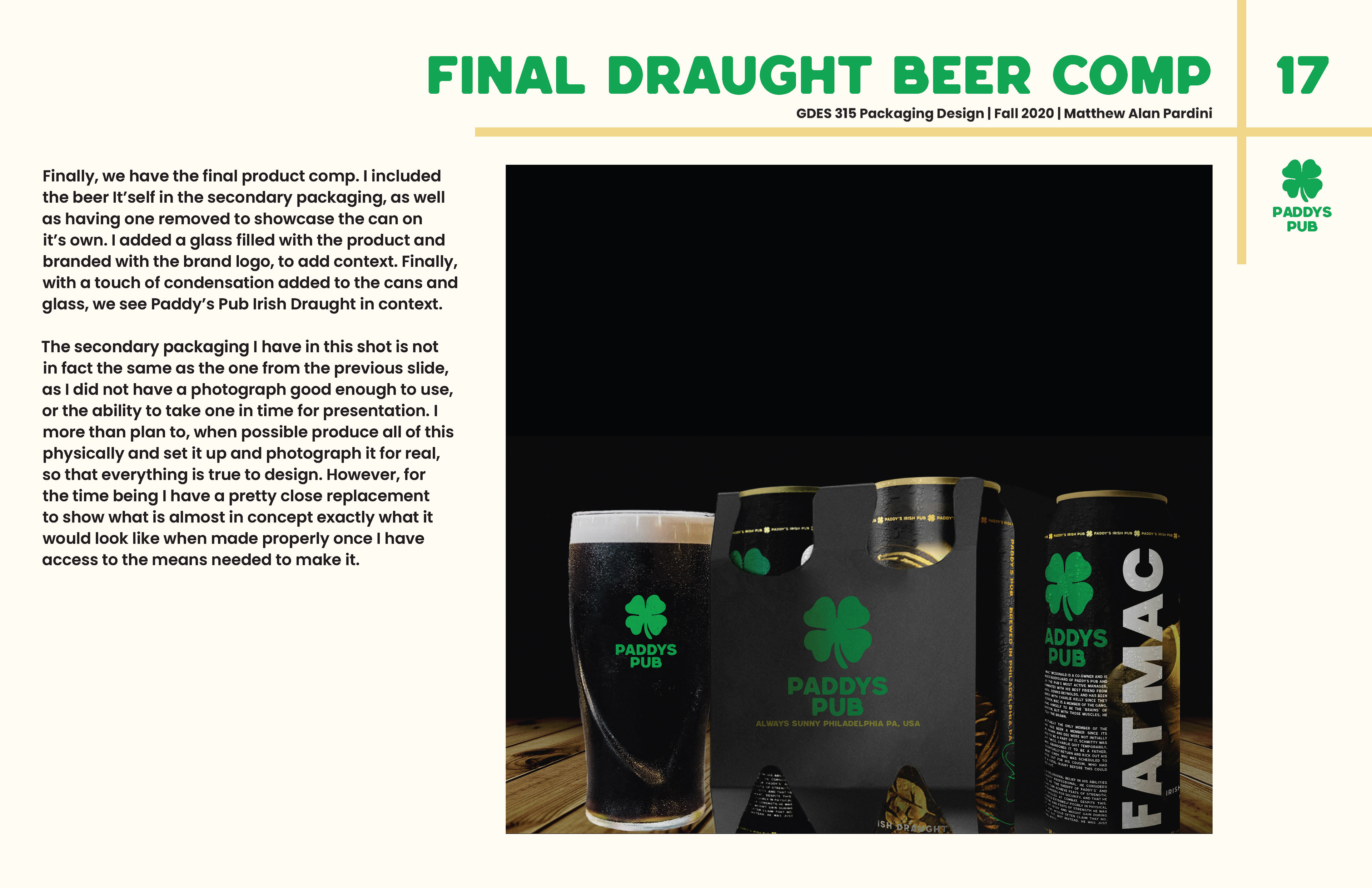
As for the box Itself, it is a very simple design. I repeated the running brand bars from the top and bottom of the cans and put them at the top of each panel, and the top and bottom of the top panel. The top features simply the brand logo, name, location and product copy. The sides feature, again, the brand copy featured on every product so far.
Chip's Poker Night
(SCHOOL)
PROJECT STORY
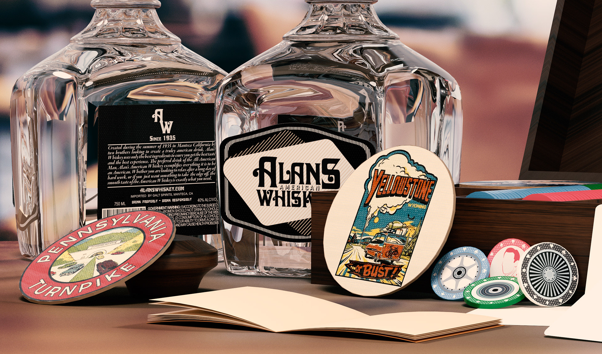
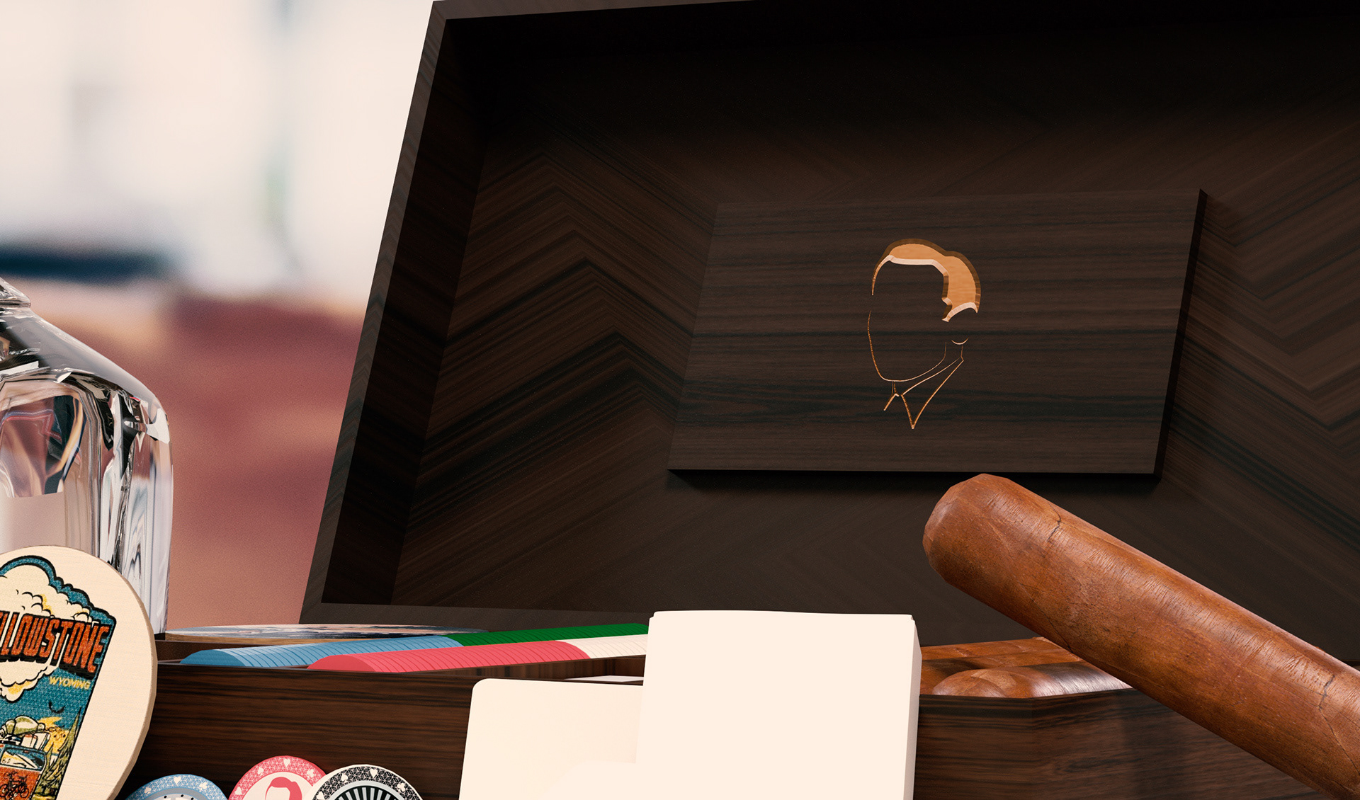
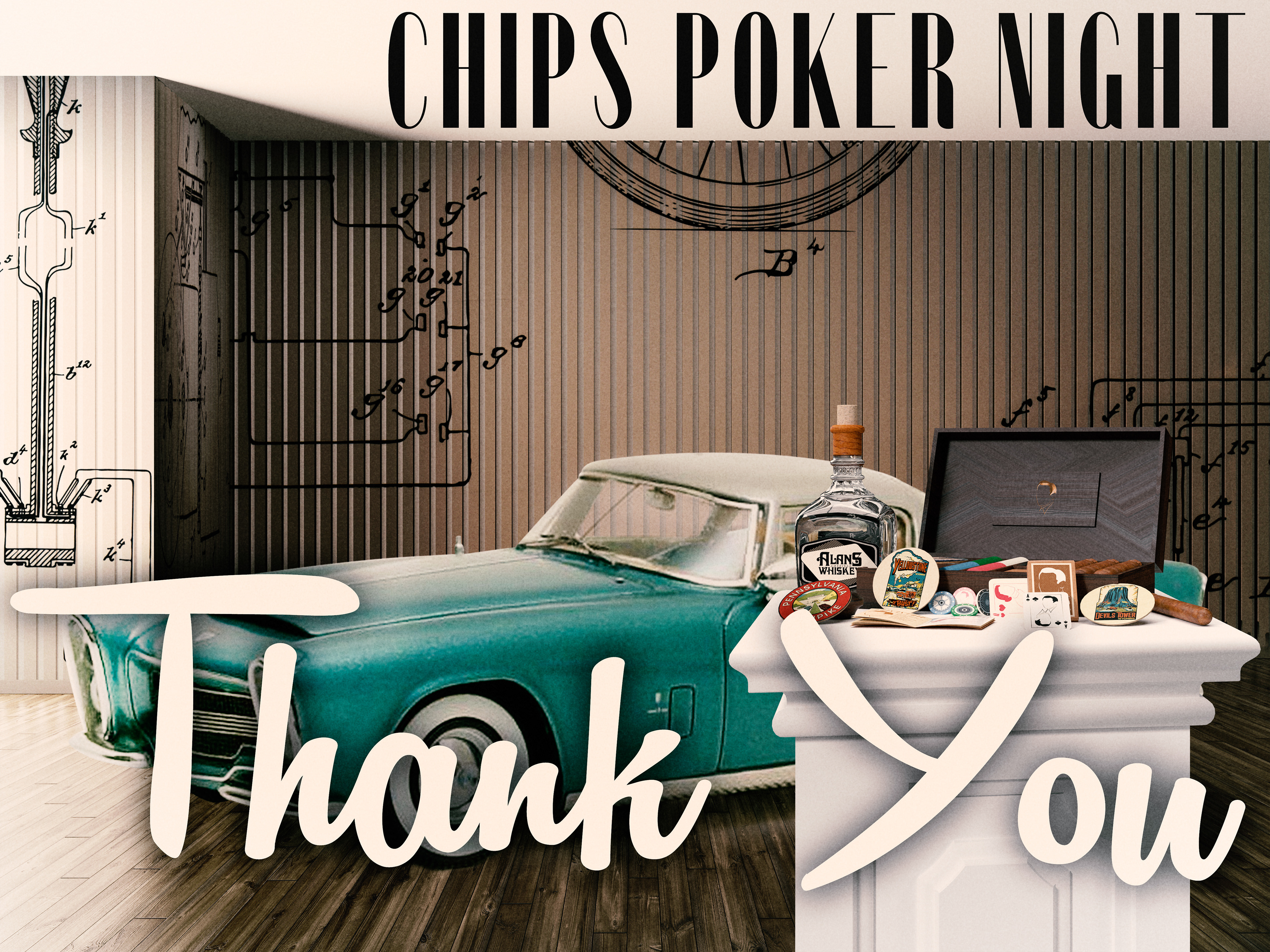
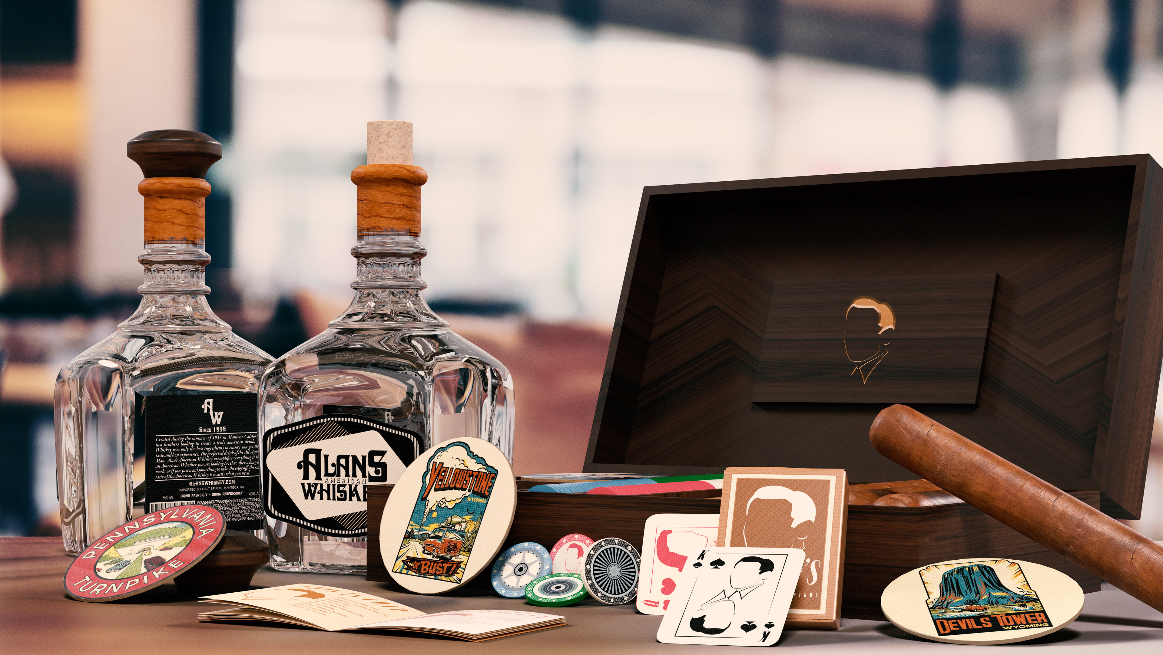
Chips Poker Night was an installation piece originally made to be part of a class competition that would have been displayed at the annual Woodbury University Fashion Show at the Peterson Automotive Museum in Los Angeles, California. Midway through this semester-long project, COVID-19 hit and we were all sent home. This limited our access to school resources and challenged all of us in creating a project that although we could no physically hold, still held value and representation for the Peterson Automotive Museum.Ā I wanted to create a lifestyle piece that helped emulate the theme and feel of the 1960s closely associated with those who enjoy classic vehicles such as sports cars, hot rods, and customs. I wanted it to be something that hypothetically would be a serve-all box one would bring to poker night with the guys. It would include everything one would need: cards, chips, cigars, as well as coasters (inspired by ones on display at the Peterson Automotive Museum)Ā to allow you to arrive and set up in a quick and easy fashion. With the poker set/cigar box would be a self-created whiskey brand to accompany the kit, but would not, in theory, be purchased with it. Instead, it's featured to help give context to the whole package. Due to COVID-19, my university went fully online, limiting us of our resources to be able to physically create this project.Ā 
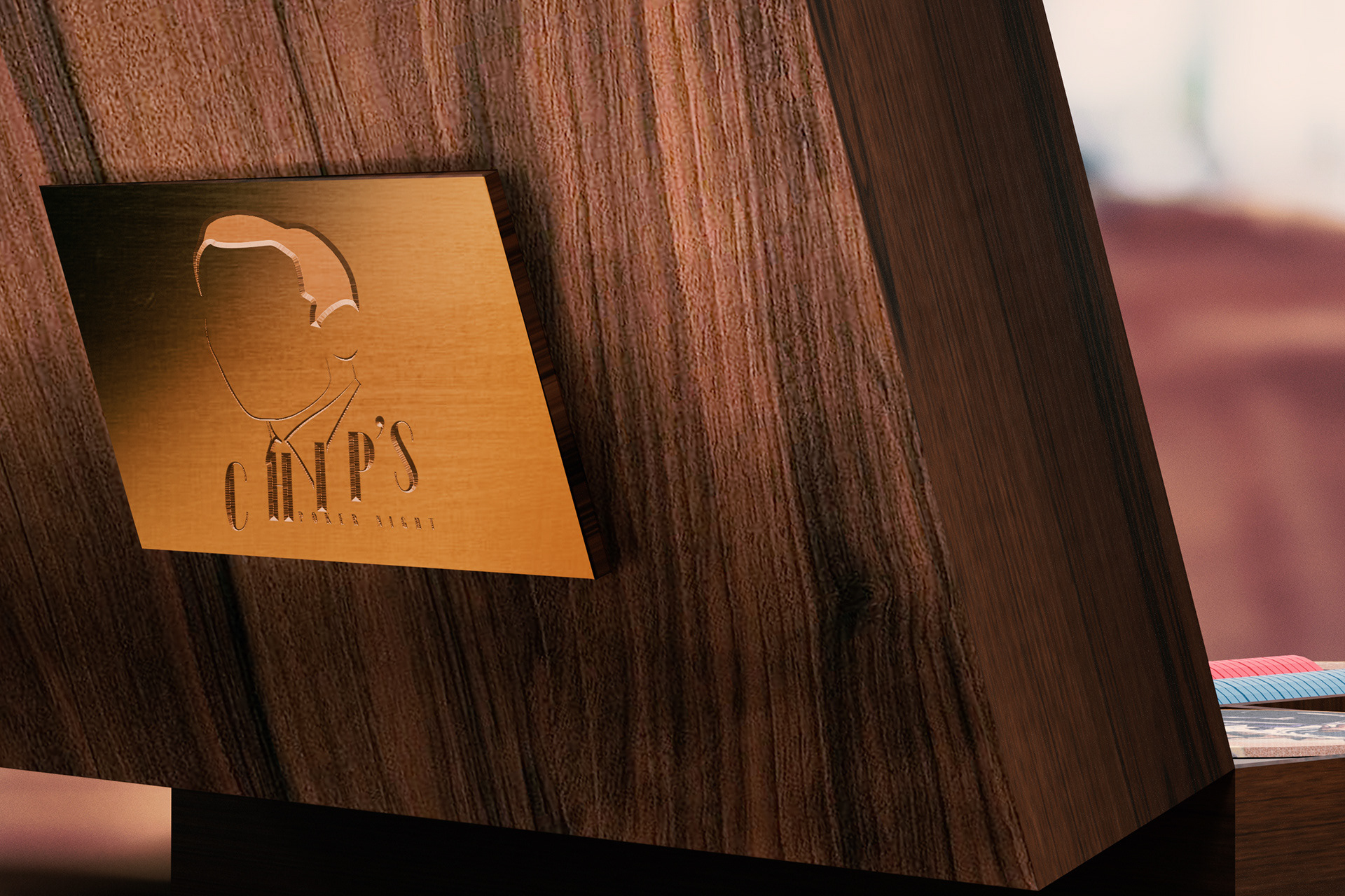
Chips Poker Night is a full poker set/ cigar box made for an everyday man's man or anybody who enjoys playing poker and smoking cigars with their friend. To stay with the theme of the automotive world, my target audience was those who love vintage vehicles and the old-school classic Americana. To achieve this, I based the set around one fictitious character, Chip. Chip is an all-American man, drives a limited edition 1953 Dodge Storm Z-250 (Which is featured at the Peterson Automotive Museum), only smokes Odyssey cigars, loves poker, whiskey, automobiles, and his wife Betty. In short, Chip is the image of everything someone who may use this set strives to be in their own way.Ā Along with the 3D model of the set, I put together a promotional video to help give the project more atmosphere. The goal of this video was to show off the cooler details of the project as a whole. While the project was never physically created due to the limitations of the global conditions, and despite the fashion show now not happening, there was still one project picked at the end of the semester to "win" and be symbolically represented for the event. My project was selected out of the 15 projects in the class and would have if conditions permitted, been displayed at the Peterson Automotive Museum for the show. I was incredibly honored, and I feel this project was one that pushed me a lot to get creative and work with what I was given in a situation that was far from optimal.
Chips Poker Night was selected out of the 15 projects in the class and would have been, if conditions permitted, displayed at the Peterson Automotive Museum for the show. I was incredibly honored, and I feel this project was one that pushed me a lot to get creative and work with what I was given in a situation that was far from optimal. As the semester progressed, I gained inspiration in several different forms that changed as the project evolved. One inspiration was the idea for a set of playing cards based on the vehicles in the Petersen Automotive Museum. That evolved into several decks and then into eventually, a whole poker set made to be a lifestyle piece. I had planned on making it completely out of wood in the wood shop provided on campus and extensively using the Digital Fabrication Lab as well. However, with the rapid development of COVID-19, conditions changed. Materials and production methods became more scarce and difficult to obtain as the country and world seemingly shut down.Ā Iā€™m not going to lie, as conditions changed and the possibilities became less easily obtainable, it was difficult to maintain my motivation to continue, but I took this opportunity to get creative and find alternative methods to complete this project to the level and quality that I know I could achieve. I learned how to use several 3D modeling programs (Blender, Rhino, and Adobe Dimensions) in order to create a virtual version of my vision that helped to create the final product in the closest and most effective way I had access to. While it wasnā€™t how I originally envisioned it, I did come out of this with new skills Iā€™m sure will benefit me for future projects in which I may be experiencing unforeseen obstacles.
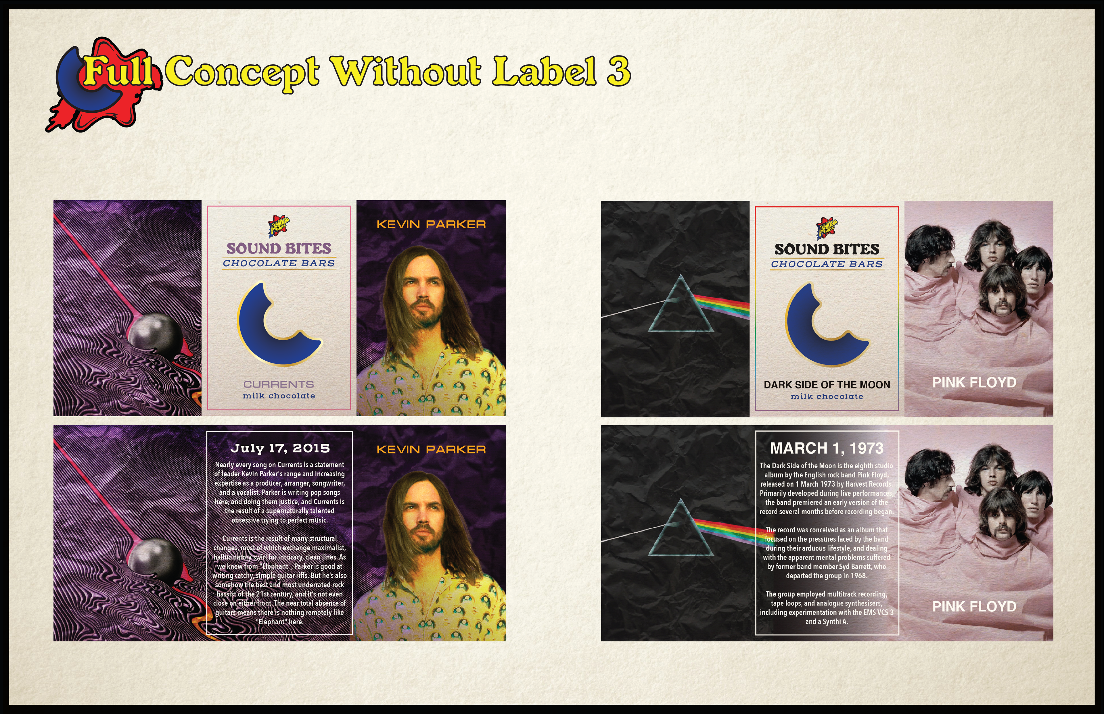
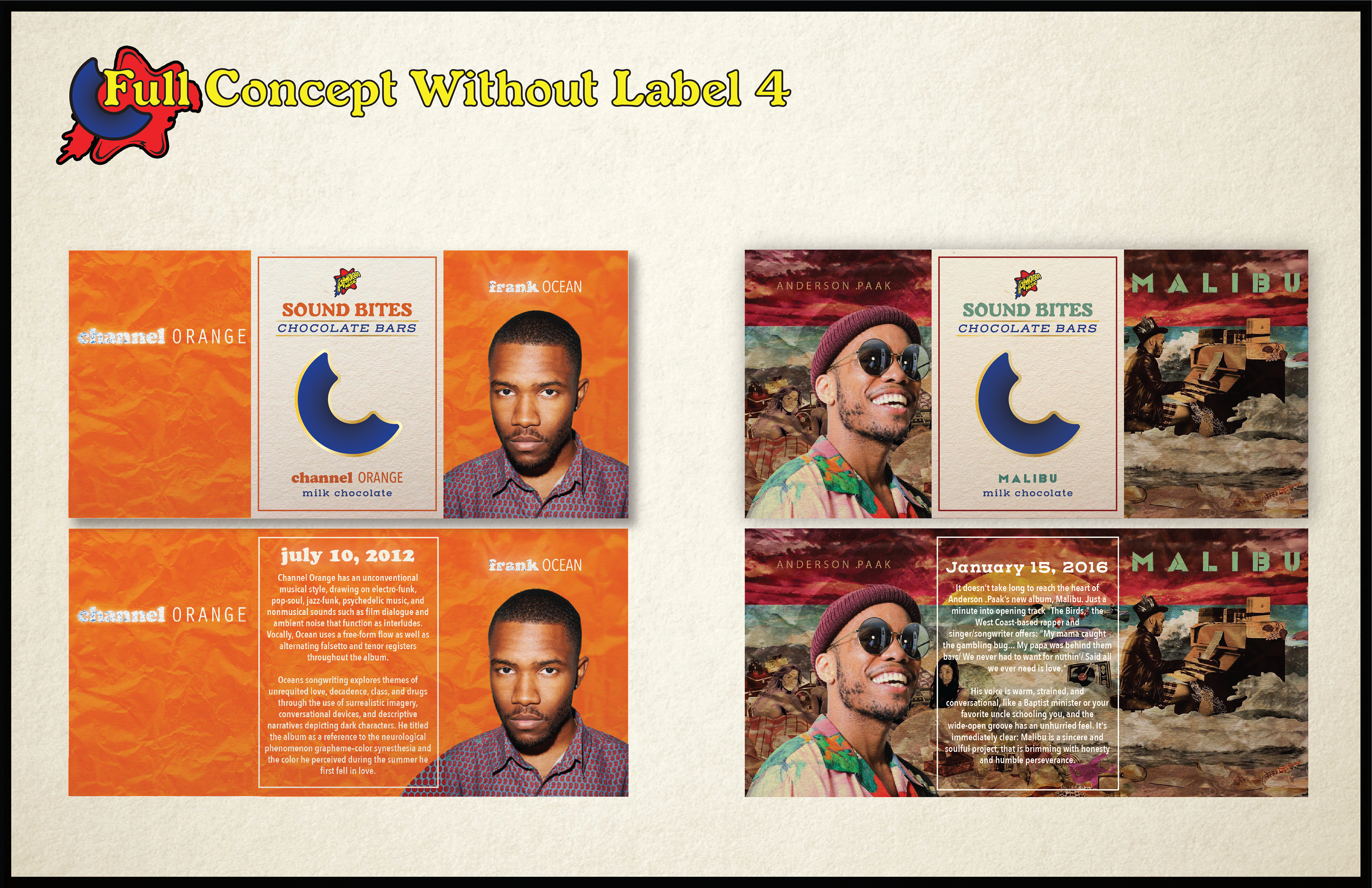
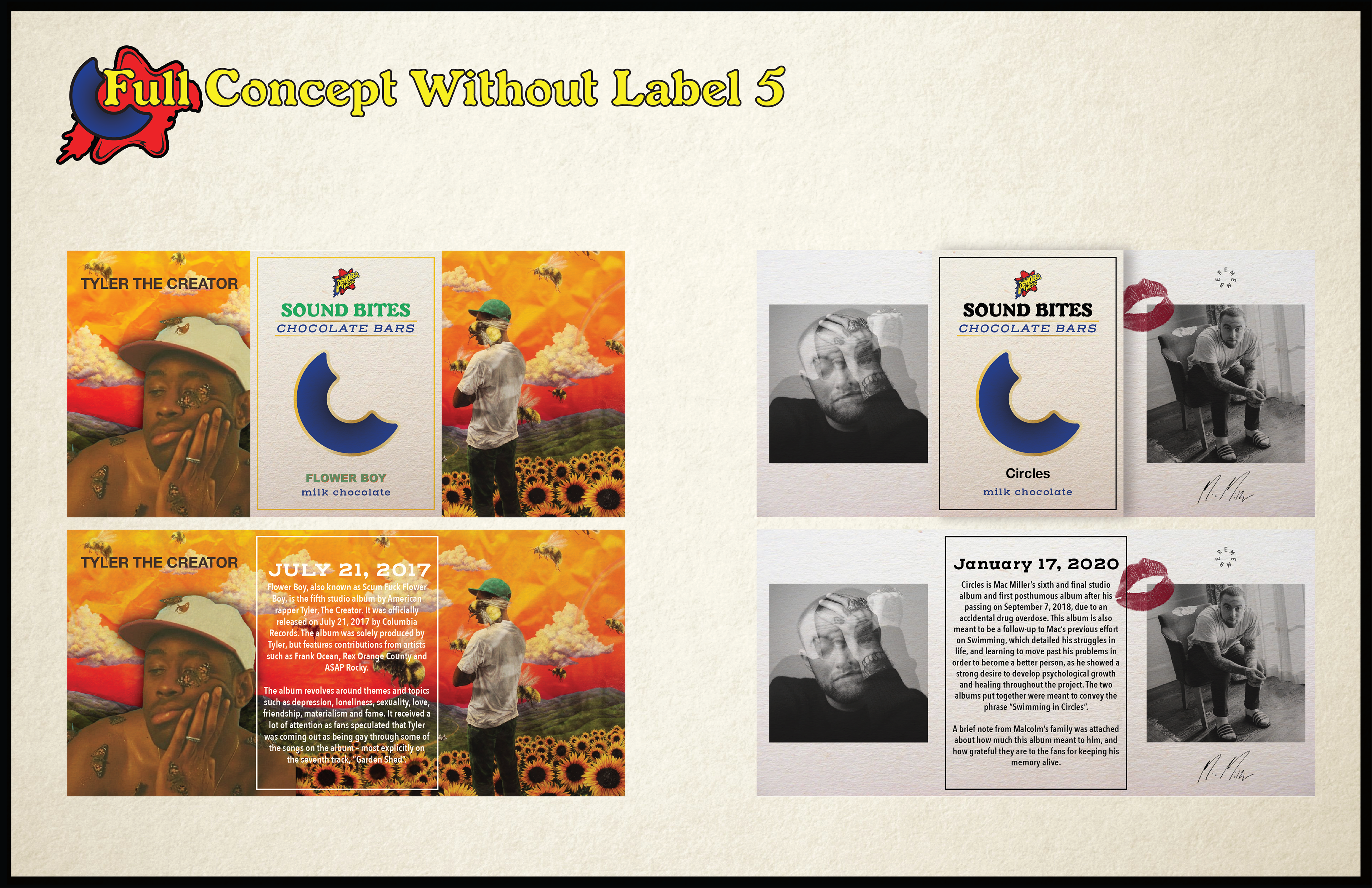
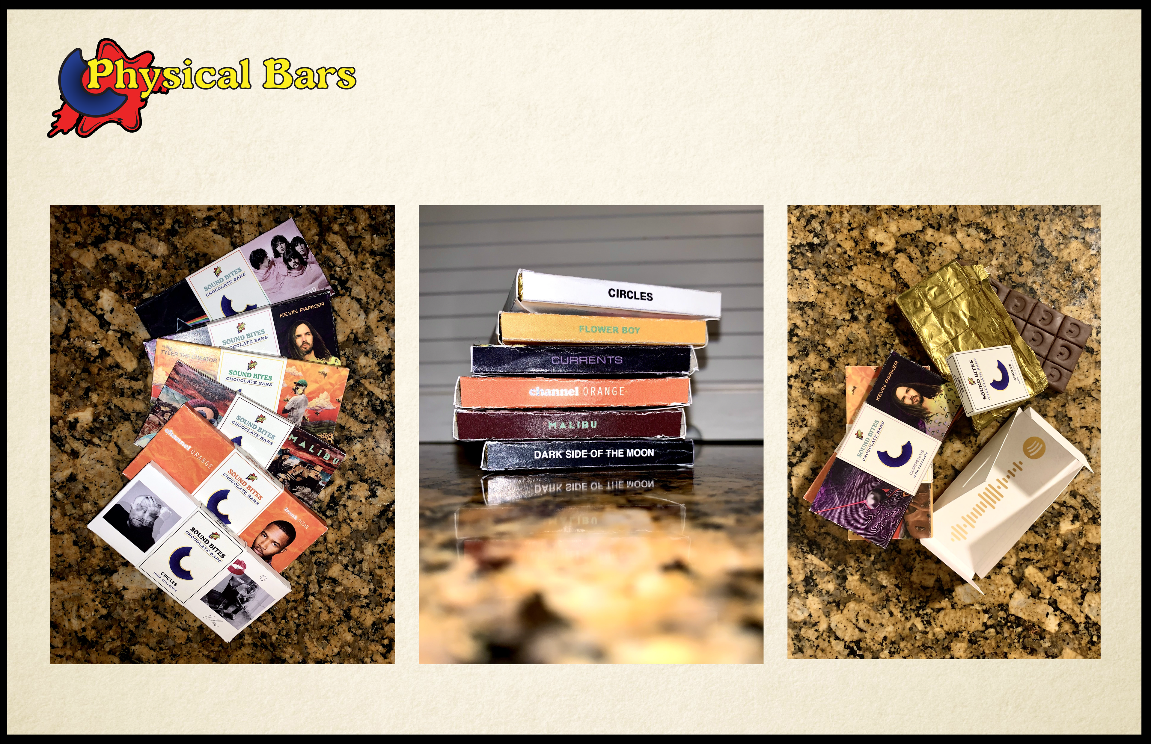
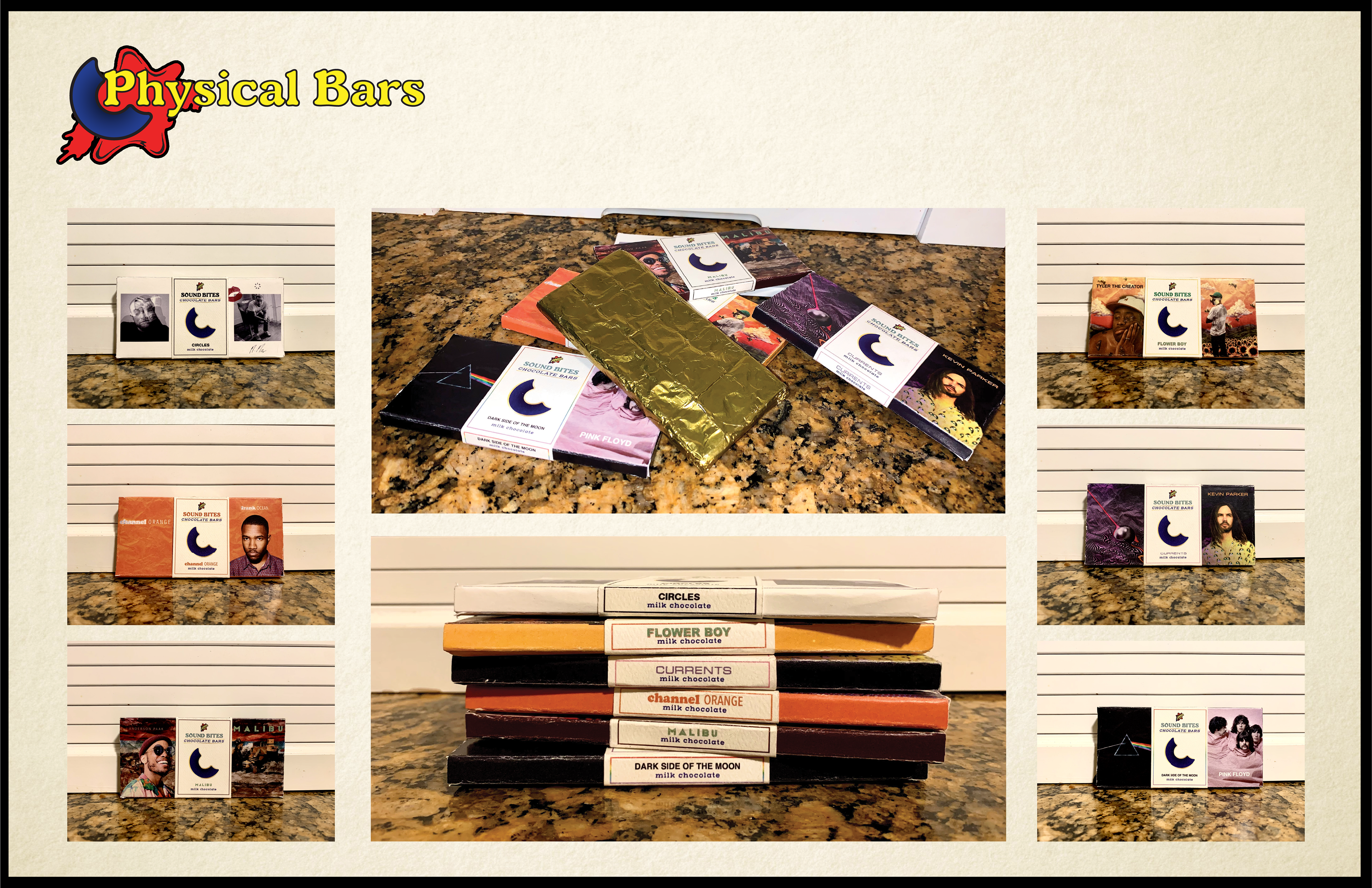
SOUND BITES
(SCHOOL)
You may also like

Back to Top